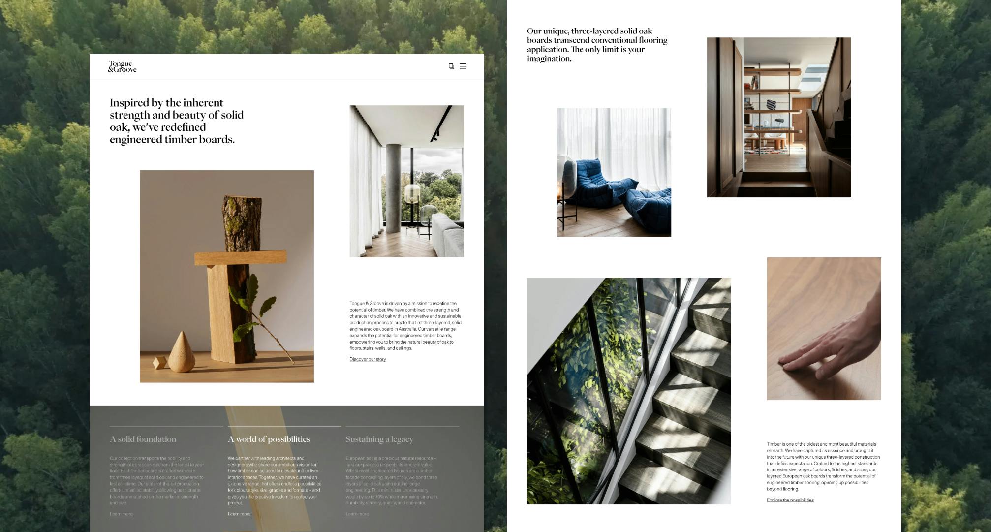
Tongue & Groove — Thoughtful customisation on a large scale site.
-
Auckland
XX:XX:XX GMT+XX
Tongue & Groove — Thoughtful customisation on a large scale site. We created an exciting new website for Tongue & Groove (T&G) in collaboration with Studio Round, who led the visual design portion of this platform. New Territory handled the development and provided consultation on lead generation and usability.

Tongue & Groove’s New Digital Platform
Built on Sanity with direct integration with Salesforce CRM, Tongue & Groove’s new digital platform was crafted to optimise the user interface and experience. Featuring a host of customisable functions, including a visualiser designed to show what the floorboards will look like upon completion, multi-layer filtering systems and interactive graphics. This website is built to be informative, accessible and engaging.
Tongue & Groove’s new and improved website is highly customisable, going above and beyond to improve the UX. Motion and interactive elements throughout the site help to bring it to life, whilst a comprehensive navigational system keeps the user flow accessible and effective.
Given the large scale of the site and the required capabilities we built Tongue & Groove’s new platform on Sanity; knowing Sanity’s cutting-edge technology would handle the demands this website required. The site was also developed with Salesforce CRM and Google Analytics integrations for improved site optimisation, SEO and lead generation capabilities.
There were no shortcuts taken with this build. Each page features thoughtful interactive elements and engaging user flows, designed to optimise T&G’s potential and bring the brand into the new age. This is best reflected by the custom-built elements across the site that well and truly set T&G apart.
Custom Interactive Features
For optimal brand transparency, Tongue & Groove provides comprehensive information about all of its products. Our challenge was to make large amounts of information digestible in an effective and engaging way. Interactive elements are one way to achieve this.
We developed animations using Lottie to create sequences that feature throughout the site. Hover elements, videos and scroll-through carousel images also help bring the site to life. Dynamic graphics is another tool we implemented to increase engagement, as seen in the interactive graph on the Our Range page. These graphics are used to showcase the height and width of various floorboards.
Highlight Feature
The Visualiser
One of our favourite parts of the site is the visualiser, created specifically by New Territory for T&G. This customisable simulation allows users to test out floorboards, applying different filters and specifications to create a realistic prototype. The side-by-side images and interactive slider allow for clear comparisons of two different styles, or a complete visualisation of a single style across floorboards, ceilings and stairs. Having this state-of-the-art functionality within the T&G site makes an enormous difference in customer retention.
Floorboards are a difficult product to shop for online, with hesitation etched into the uncertainty of what they’ll actually look like in person. Whether customers are looking for one specific style, are narrowing down their final choices, or are at the start of their search, the visualiser allows them to preview options before requesting samples or quotes. This not only increases the accessibility of T&G’s products but improves the effectiveness of the platform. Giving customers greater assurance, increasing brand equity, and streamlining the overall experience.
PDP Option Configuration
Another custom feature we created was the product page option configuration. For each style of wood, there are a host of interactive settings, allowing consumers to get a deeper understanding of the range and what the various formats look like. This multi-layer filtering improves efficiency and streamlines the browsing process, increasing the usability of the site.

Customisable Filter Functionality
The wider range page also features a customisable search, allowing the full selection to be sorted from light to dark or A-Z. Likewise, the project page features a multi-layer filtering system to help sort through the extensive range of projects. Not only are exact specifications of the various types of wood listed on each individual project themselves, but the filter system also allows customers to search by colour, format, grade, style, application, project type and location.
We’re proud to have been part of the Trans-Tasman collaboration that created Tongue & Groove’s new digital platform. With a myriad of thoughtful custom features, we believe this site stands out as a unique user-focused experience - and ultimately, is an enjoyable site to explore.
Why not go and check it out for yourself?
Glossary
UX: User Experience
UI: User Interface
PDP: Product Description Page
SEO: Search Engine Optimisation


